Boulder Lab
Rebrand, strategy and application
A rebrand including research, strategy and application bring Boulder Lab in line with its competitors. Logo design, animation, brand guidelines, website, social media, merchandise and photography was produced to create a fun and colourful new brand identity.


Brand Guideline Document Preview

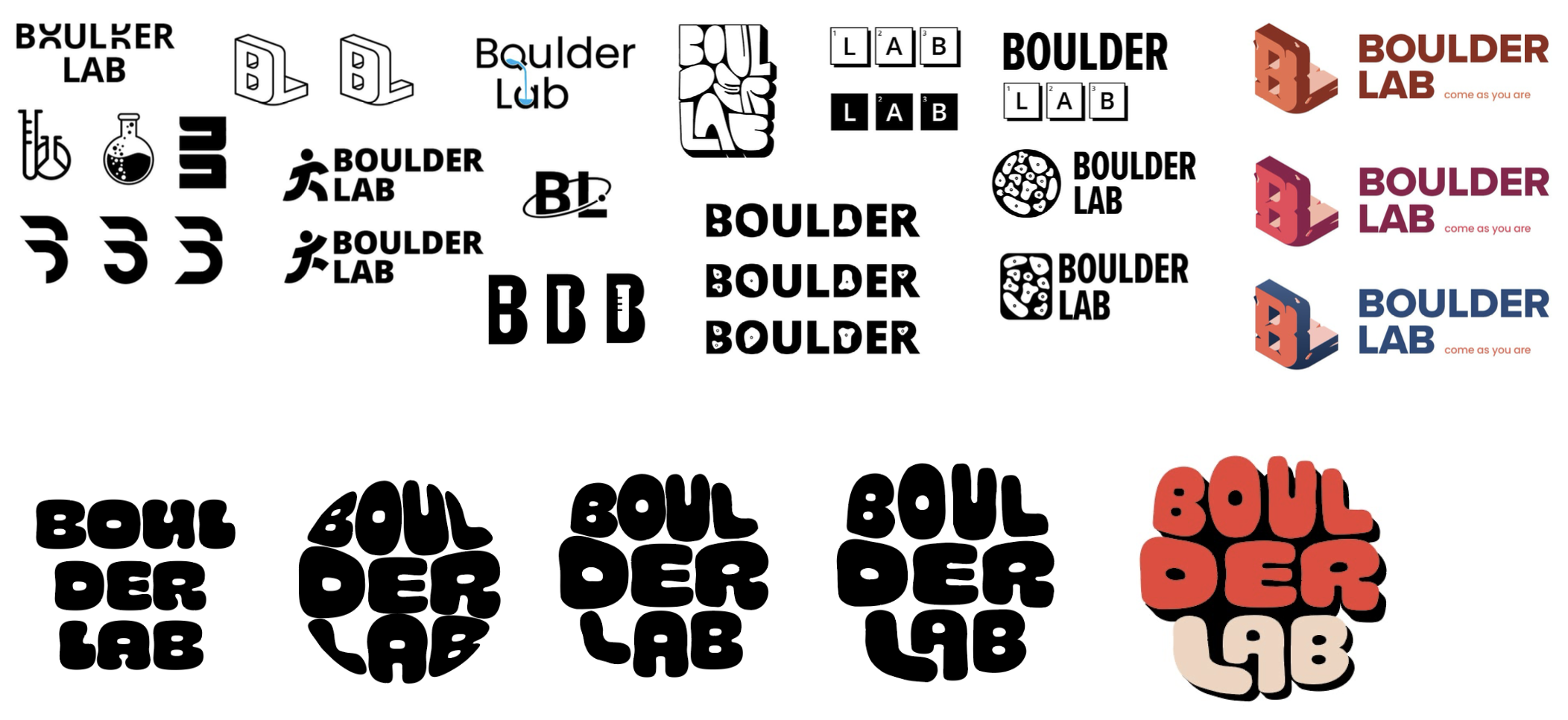
Logo Development


The rebranding strategy:
Reflects the brands identity and values.
Adds a unique design style that reflects the climbing community.
Strengthens the brand identity through consistent application.
Enhances recognition and perception with a bold design style.
Reaches new customers and strengthens existing customer loyalty.
The design thinking behind the logo was that it reflects the main brand value of fun, this is through the use of bold and varied colours and also the organic shapes. The dark background makes the logo feel grounded and also creates a 3D effect which lends itself to the physical nature of climbing. The counters inside the letters also represent that shapes of holds themselves
The new brand slogan ‘come as you are’ means that climbing is accessible for everyone to try, you don’t need any special equipment and can even go by yourself.
All the photography featured on the website and social media was self generated.
The t-shirt design features a slogan and image on the back, static refers to a style of climbing that is slow and controlled, much like a sloth is. The words climber club create a sense of community and belonging.
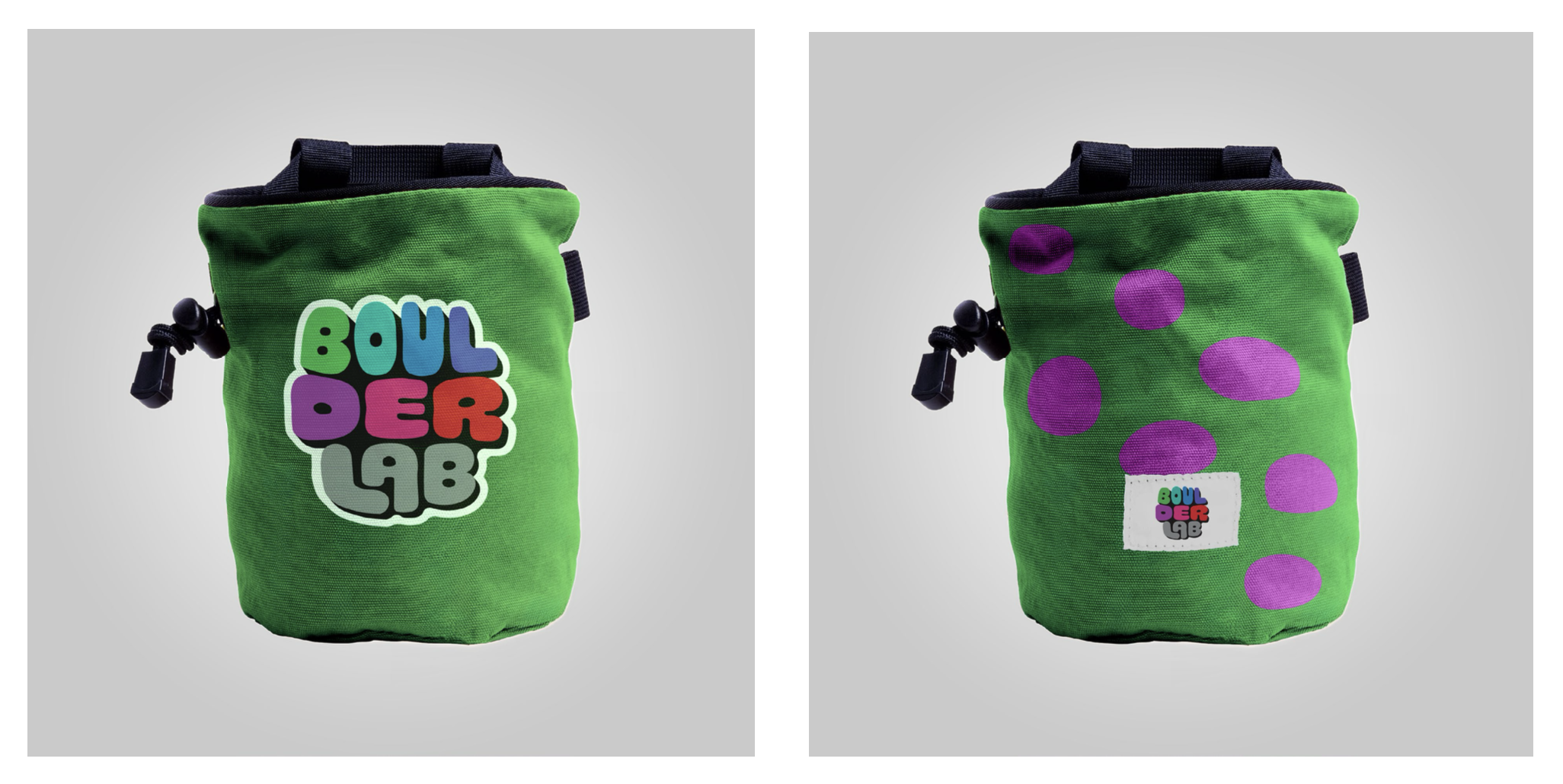
The chalk bag designs feature colour combinations from the logo and the counter pattern which reflect the shapes of climbing holds.
The drink bottle designs feature a climbing hold as the handle, its a fun and unique element that has a duel purpose of improving your grip strength whilst using it as a handle.
